Three web3 veterans. Decades of combined experience. One observation.
Creative services in this space either lacked cultural fluency or leaned too hard into degen aesthetics. Studios that understood web3 couldn't execute at a senior level. Studios with senior talent didn't speak the language. We built OWWO to fill that middle ground, and designing our own brand became the first test of whether we could actually pull it off.
Here's how we did it.
{{divider}}
The Starting Point
Web3 moves fast. Brands need to cut through without feeling forced. And most visual identities in this space fall into two traps: neon crypto aesthetics that scream "we're trying too hard," or sterile corporate polish that whispers "we don't actually get it."
Our challenge was different. We needed an identity that reflects our trifecta: senior craft from decades in design and marketing, AI fluency as a multiplier across everything we do, and deep roots in web3 since 2017. That's a lot to communicate visually. But that's also the job.
We started with internal workshops. Bold statements. Creative risks. A tone of voice that skips the fluff. We mapped our personality until we had something concrete to design against.
{{divider}}
Research and Strategy
We knew the positioning. The question was how to make it visual.
Our competitive analysis confirmed what we suspected: most web3 studios lean hard into one aesthetic. Either maximalist crypto energy or sanitized corporate minimalism. Neither felt right for what we wanted to build.
So we focused on what the visual system actually needed to do. It had to scale. Social posts, blog headers, generative imagery, client presentations, pitch decks. One system serving dozens of use cases. And it had to work with AI from day one, not as an afterthought, but as the foundation. We'd use AI to explore variations, test directions, and eventually automate asset creation without losing the craft that makes work distinctive.
{{divider}}
Visual Identity Development
Logo
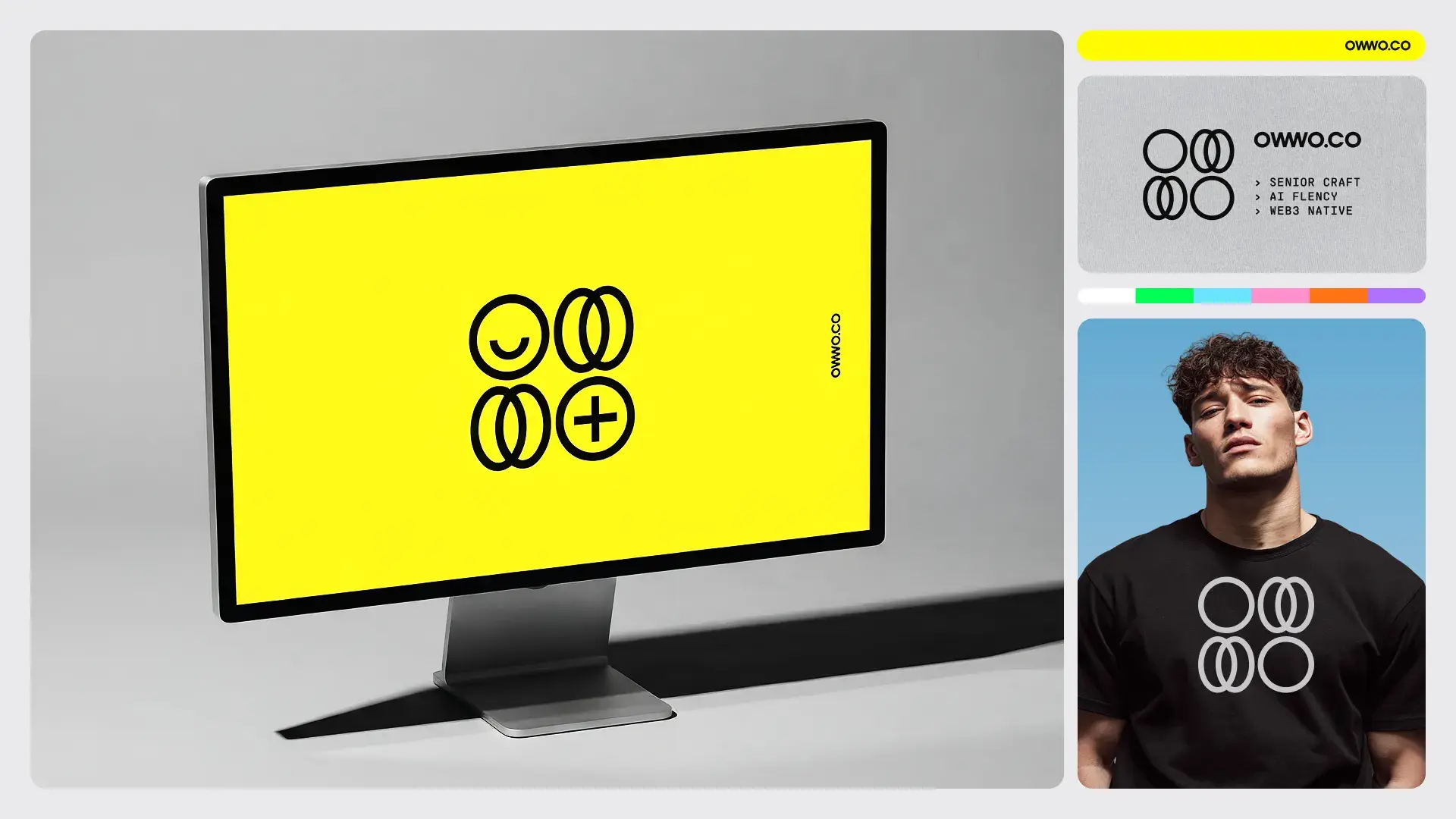
We started with the logo. It needed to feel dynamic. Daring. But grounded enough for enterprise conversations where people take themselves seriously.
Our name "OWWO" evokes that "wow" moment when ideas click. The goal was to synthesize that emotion into a mark, which is harder than it sounds because you're trying to make typography feel like a feeling.
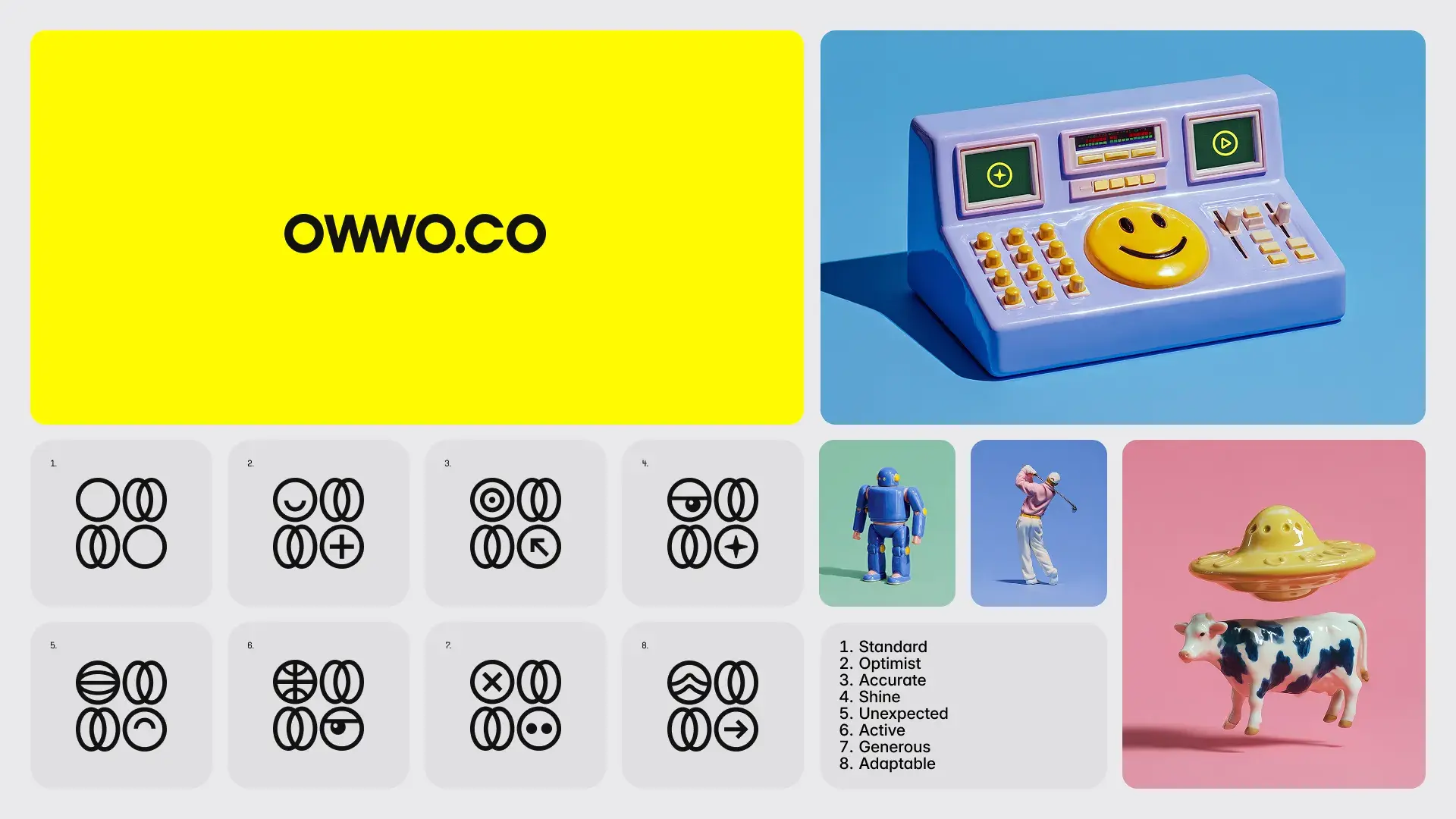
Early sketches ranged from experimental forms to direct typographic approaches. This exploration phase is where volume matters. Generate dozens of directions. Kill most of them. Let the survivors compete. The final logo abstracts our name into a wordmark that animates with interchangeable icons, so different contexts get different icons but the same core identity. Built for infinite variations.
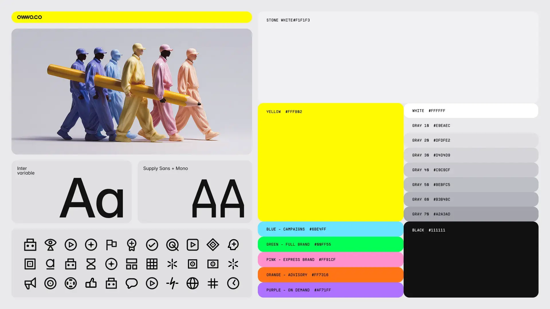
Color
Bright yellow dominates. High contrast. Impossible to ignore on any screen.
We designed digital-first, not print-adapted, because that's where our work lives. The primary palette gets balanced by neutral grays that keep things readable without losing energy. And while our brand leans bright overall, the system gives us flexibility for dark modes when the context demands it.
Typography
Inter Variable with single-story 'a' activated. It's open source, widely accessible, and contemporary. A small customization that adds personality without sacrificing readability.
Supply Sans Mono handles subheadings. The monospace adds technical credibility and pairs well with Inter's clean proportions. Together they say "we're serious about craft" without saying "we're a bank."
{{divider}}
Visual Universe
This is where we broke from the pack.
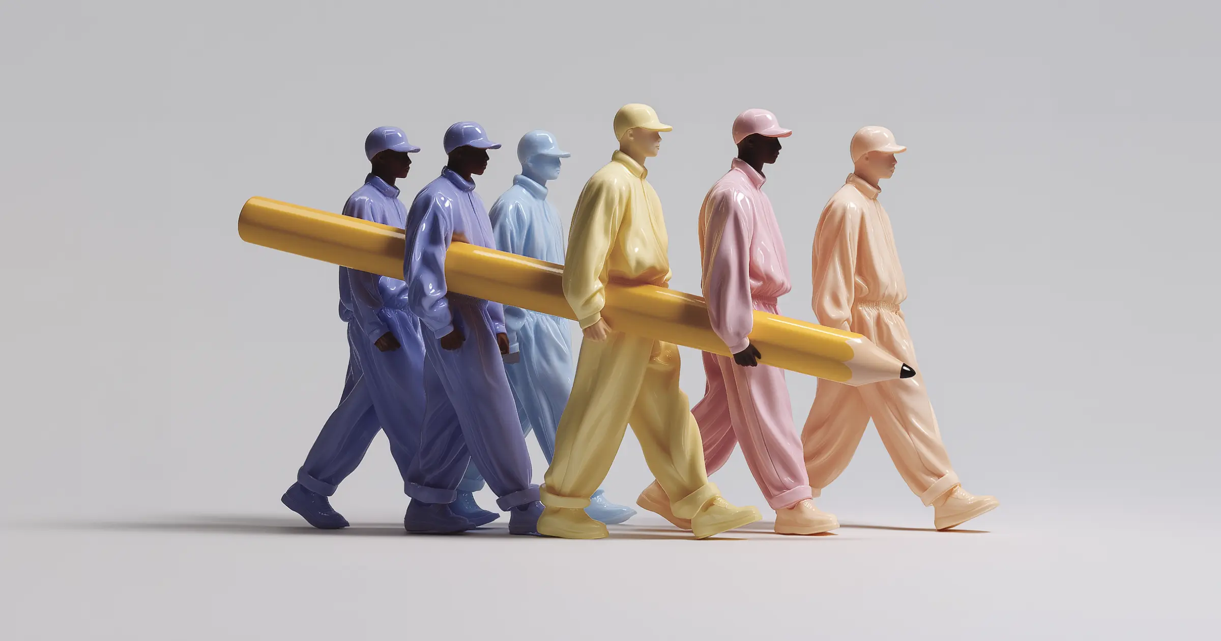
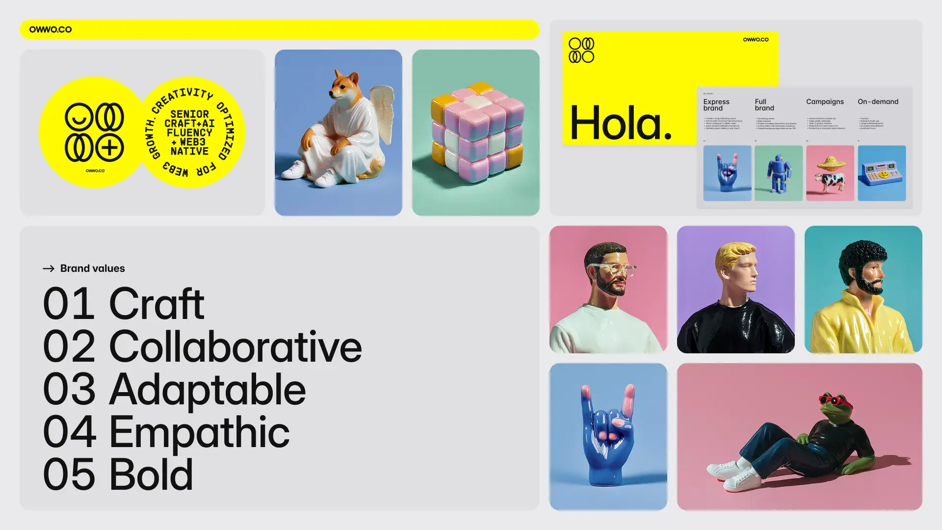
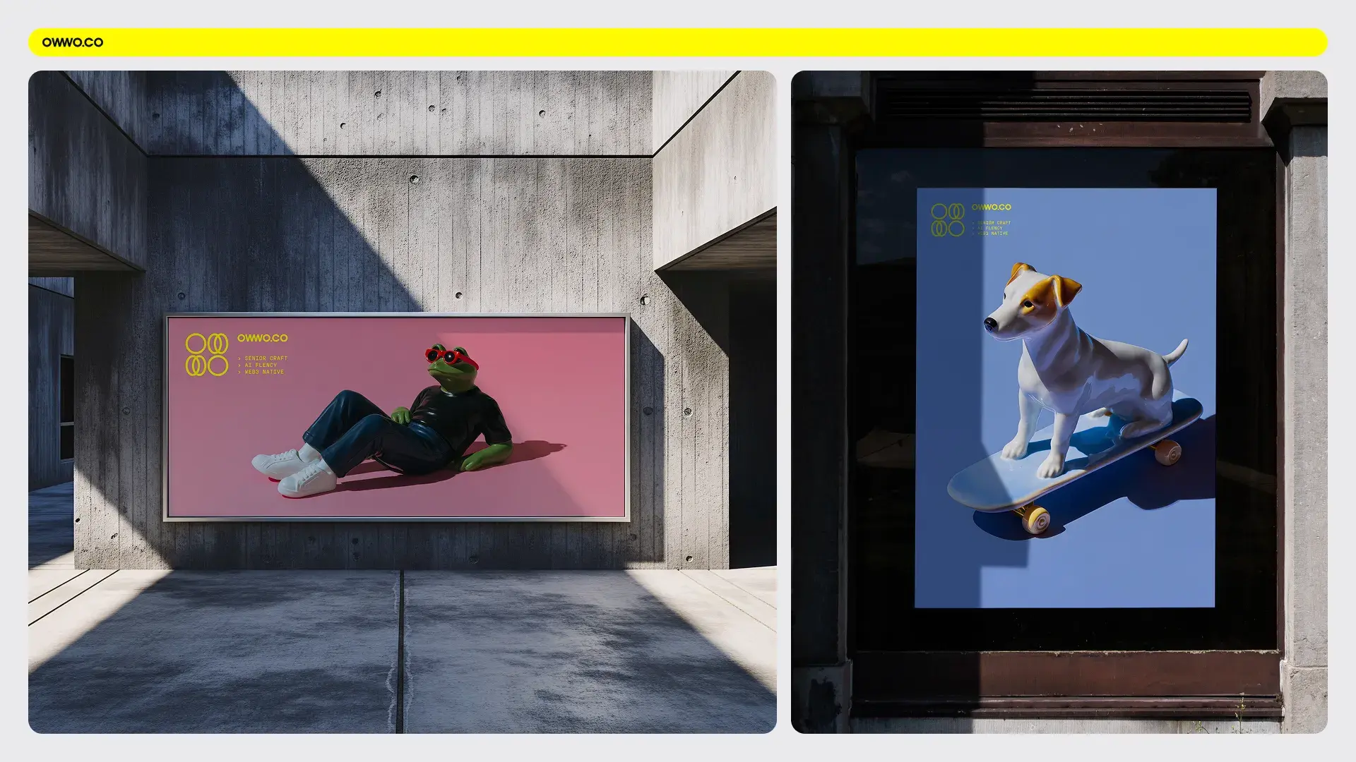
We built an entire world of modern, surreal objects rendered in porcelain style. Not because it was trendy. Because it meant something.
Porcelain represents craft. Handmade originals that became collectible objects. Mass-produced, yet each piece feels intentional. It hints at something familiar, like the figurines you might find at grandma's place, delicate things that someone cared enough to keep.
We took this classic form and updated it. Surreal compositions. Bright, bold colors. Objects that feel nostalgic but couldn't have existed before AI. In essence, we brought a traditional craft into a generative present, and that tension between old and new captures exactly what OWWO is about: senior experience meeting new technology.

The AI Workflow
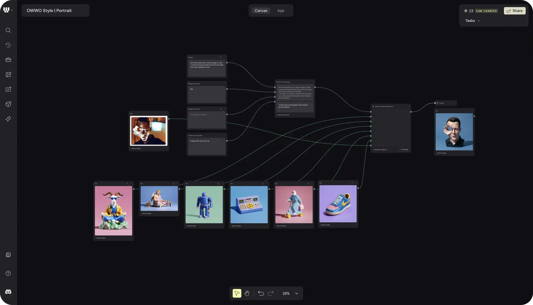
We used Midjourney to explore initial directions. Hundreds of generations. Most got cut.
But here's what matters: senior craft meant knowing which 5% to pursue. The AI generates volume. Experience identifies winners. Anyone can make a hundred images. Knowing which three are worth keeping requires years of pattern recognition that no prompt can replace.
Once we locked 50 final images, we trained a Flux model on them. Now we generate new assets in our visual style on demand. Same porcelain aesthetic. Infinite variations. Consistent across every touchpoint. This workflow captures what we mean by AI fluency: the tools accelerate exploration, the craft guides selection, and neither works without the other.
Try It Yourself: Generate Your Custom Porcelain Figurine
We created a custom AI image workflow with Weavy AI. Weavy lets you build workflows and automate them into apps that replicate your image style at scale.
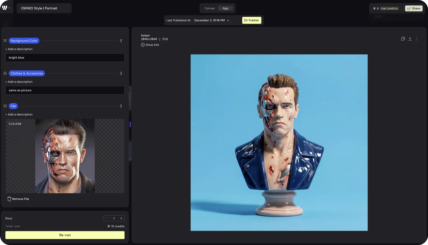
Upload a portrait. Get a porcelain figurine that matches OWWO's brand aesthetic. It's that simple.
{{divider}}
What This System Enables
OWWO's visual identity now scales across every touchpoint. The porcelain universe appears in hero images, social content, proposals, and client presentations. One trained model, infinite outputs, consistent aesthetic.
The system adapts without breaking. New campaign? Generate fresh porcelain objects that fit the theme. New blog post? Pull from the visual library or create something new in minutes. The constraint of the style becomes freedom rather than limitation.
But the real measure is recognition.
People remember us before they see our name. That's what a distinctive visual system creates. Recall. Trust before the first conversation even happens.
This is senior craft meeting AI fluency. Not generic outputs. Not predictable aesthetics. A brand universe that couldn't have existed two years ago, built by people who've been creating brands for decades. That combination is rare. And that's exactly why it works.
Three web3 veterans. Decades of combined experience. One observation.
Creative services in this space either lacked cultural fluency or leaned too hard into degen aesthetics. Studios that understood web3 couldn't execute at a senior level. Studios with senior talent didn't speak the language. We built OWWO to fill that middle ground, and designing our own brand became the first test of whether we could actually pull it off.
Here's how we did it.
{{divider}}
The Starting Point
Web3 moves fast. Brands need to cut through without feeling forced. And most visual identities in this space fall into two traps: neon crypto aesthetics that scream "we're trying too hard," or sterile corporate polish that whispers "we don't actually get it."
Our challenge was different. We needed an identity that reflects our trifecta: senior craft from decades in design and marketing, AI fluency as a multiplier across everything we do, and deep roots in web3 since 2017. That's a lot to communicate visually. But that's also the job.
We started with internal workshops. Bold statements. Creative risks. A tone of voice that skips the fluff. We mapped our personality until we had something concrete to design against.
{{divider}}
Research and Strategy
We knew the positioning. The question was how to make it visual.
Our competitive analysis confirmed what we suspected: most web3 studios lean hard into one aesthetic. Either maximalist crypto energy or sanitized corporate minimalism. Neither felt right for what we wanted to build.
So we focused on what the visual system actually needed to do. It had to scale. Social posts, blog headers, generative imagery, client presentations, pitch decks. One system serving dozens of use cases. And it had to work with AI from day one, not as an afterthought, but as the foundation. We'd use AI to explore variations, test directions, and eventually automate asset creation without losing the craft that makes work distinctive.
{{divider}}
Visual Identity Development
Logo
We started with the logo. It needed to feel dynamic. Daring. But grounded enough for enterprise conversations where people take themselves seriously.
Our name "OWWO" evokes that "wow" moment when ideas click. The goal was to synthesize that emotion into a mark, which is harder than it sounds because you're trying to make typography feel like a feeling.
Early sketches ranged from experimental forms to direct typographic approaches. This exploration phase is where volume matters. Generate dozens of directions. Kill most of them. Let the survivors compete. The final logo abstracts our name into a wordmark that animates with interchangeable icons, so different contexts get different icons but the same core identity. Built for infinite variations.
Color
Bright yellow dominates. High contrast. Impossible to ignore on any screen.
We designed digital-first, not print-adapted, because that's where our work lives. The primary palette gets balanced by neutral grays that keep things readable without losing energy. And while our brand leans bright overall, the system gives us flexibility for dark modes when the context demands it.
Typography
Inter Variable with single-story 'a' activated. It's open source, widely accessible, and contemporary. A small customization that adds personality without sacrificing readability.
Supply Sans Mono handles subheadings. The monospace adds technical credibility and pairs well with Inter's clean proportions. Together they say "we're serious about craft" without saying "we're a bank."
{{divider}}
Visual Universe
This is where we broke from the pack.
We built an entire world of modern, surreal objects rendered in porcelain style. Not because it was trendy. Because it meant something.
Porcelain represents craft. Handmade originals that became collectible objects. Mass-produced, yet each piece feels intentional. It hints at something familiar, like the figurines you might find at grandma's place, delicate things that someone cared enough to keep.
We took this classic form and updated it. Surreal compositions. Bright, bold colors. Objects that feel nostalgic but couldn't have existed before AI. In essence, we brought a traditional craft into a generative present, and that tension between old and new captures exactly what OWWO is about: senior experience meeting new technology.
The AI Workflow
We used Midjourney to explore initial directions. Hundreds of generations. Most got cut.
But here's what matters: senior craft meant knowing which 5% to pursue. The AI generates volume. Experience identifies winners. Anyone can make a hundred images. Knowing which three are worth keeping requires years of pattern recognition that no prompt can replace.
Once we locked 50 final images, we trained a Flux model on them. Now we generate new assets in our visual style on demand. Same porcelain aesthetic. Infinite variations. Consistent across every touchpoint. This workflow captures what we mean by AI fluency: the tools accelerate exploration, the craft guides selection, and neither works without the other.
Try It Yourself: Generate Your Custom Porcelain Figurine
We created a custom AI image workflow with Weavy AI. Weavy lets you build workflows and automate them into apps that replicate your image style at scale.
Upload a portrait. Get a porcelain figurine that matches OWWO's brand aesthetic. It's that simple.
{{divider}}
What This System Enables
OWWO's visual identity now scales across every touchpoint. The porcelain universe appears in hero images, social content, proposals, and client presentations. One trained model, infinite outputs, consistent aesthetic.
The system adapts without breaking. New campaign? Generate fresh porcelain objects that fit the theme. New blog post? Pull from the visual library or create something new in minutes. The constraint of the style becomes freedom rather than limitation.
But the real measure is recognition.
People remember us before they see our name. That's what a distinctive visual system creates. Recall. Trust before the first conversation even happens.
This is senior craft meeting AI fluency. Not generic outputs. Not predictable aesthetics. A brand universe that couldn't have existed two years ago, built by people who've been creating brands for decades. That combination is rare. And that's exactly why it works.